Designing a classic
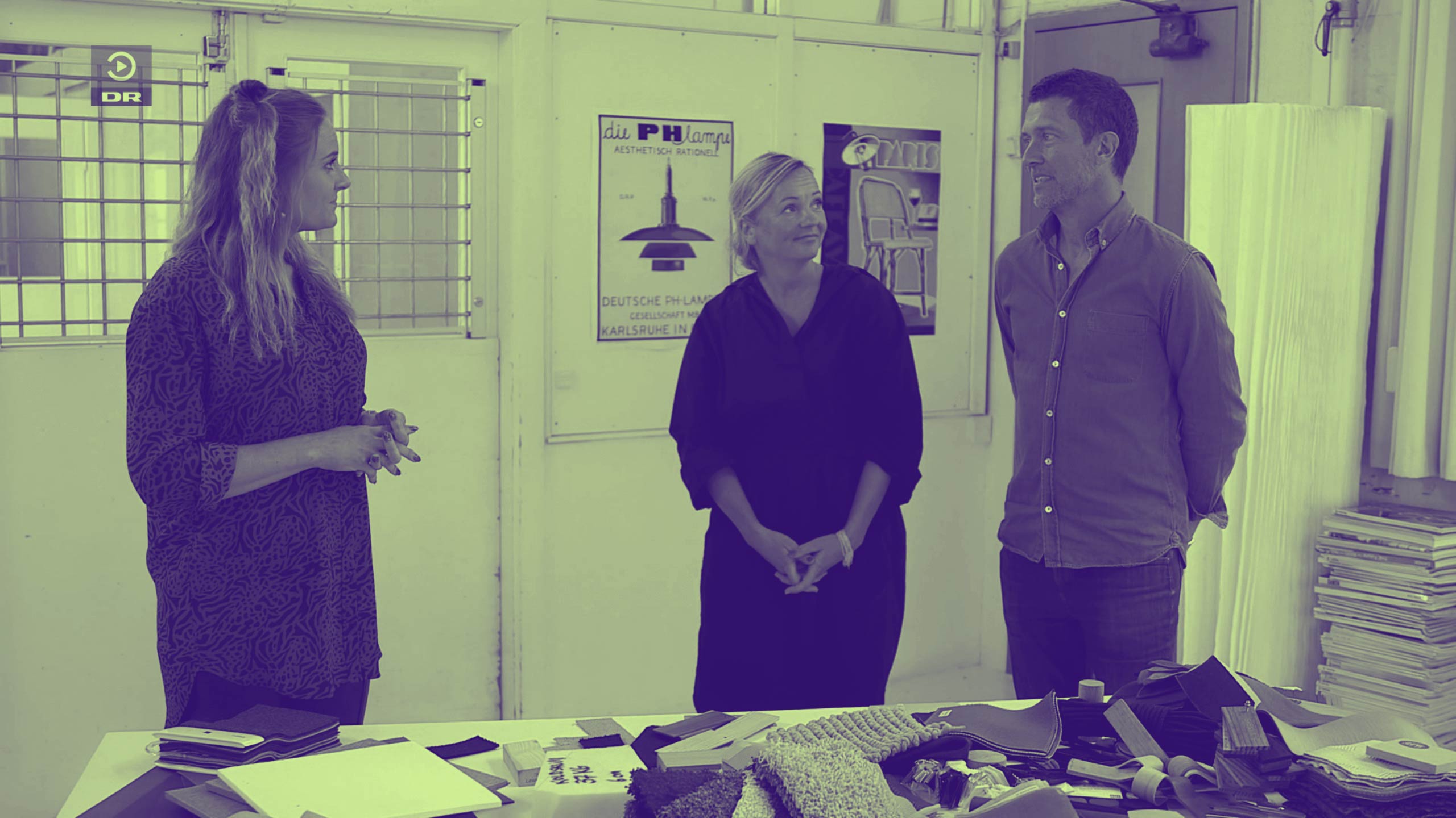
For three season’s running, I’ve had the honour of being one of two judges in the Danish television series, Denmark Next Classic.
The premise for this programme is fairly simple but tough: Five designers get three weeks to develop a piece of furniture, to a specific brief. Each programme focuses on a specific category – ‘chair’, ‘sofa’, ‘lamp’, ‘table’, we’ve even had ‘home office’ – and we find a winner in each category. At the end of the season, we select the product that we believe is best qualified to become Denmark’s new design classic.
The programme has been a huge success. It’s had great ratings and given the contestants a lot of well-deserved exposure in the industry. Some of them have even been approached by manufacturers and got their products on the market.
It’s also been a real eye opener for me as a designer and as someone who had to assess the work of others.
First of all, I’ve seen how much work can get done in very little time. The whole design process compressed into three weeks! In front of cameras and thousands of viewers! This not only calls for solid professional skills; it also calls for a great deal of personal courage.
As ‘professional species’ go, we designers are typically rather private people. For much of the time, we work on our own, and we’re used to having time to reflect and test our ideas. So to enter a competition with this level of exposure and pressure to perform is, in my view, fairly heroic. I’m not sure I would have dared myself.
Then there’s the very title of the programme – Denmark’s Next Classic – which ups the pressure even more. Not only for the contestants, but also for us as judges.
I had to get my own thoughts straight on what ‘a classic’ actually means?
For me, there’s something almost Darwinistic about a classic. It’s a product that has stood the test of time. It has survived and proven ‘the fittest’. Not because it looks good but because it’s well made and presents a relevant solution to a problem for a lot of people.
At the same time, a classic also suggests an element of foresight or intuition. The designer’s ability to look into the future and anticipate what relevant looks like in years to come. Which means you won’t create a classic if you’re too retrospective or in awe of tradition.
The whole premise of setting out to create a classic is actually rather bizarre. For most of us, it’s not something we set out to do; it’s something we can only hope for. Future generations will decide whether our products really qualify as such.
Staying curious
The process from idea to finished object has always fascinated me. Moving from nothing to something. That process is fundamental to any design process. Whether you’re creating furniture, fashion or products.
My approach tends to be fairly open, driven primarily by curiosity. For me, learning more about new materials and testing what they can do, are probably the most exciting and challenging phases of the design process.
As a cabinet maker, I’m trained in wood, but that doesn’t mean I shouldn’t challenge this material or even replace it with something I’m less familiar with. We all have our individual preferences when it comes to the materials we choose and the categories we work in. But if we want to create something new, we have to move beyond the familiar. Be curious and fearless. For a designer, the danger zone is not the unknown; it’s staying in the comfort zone.
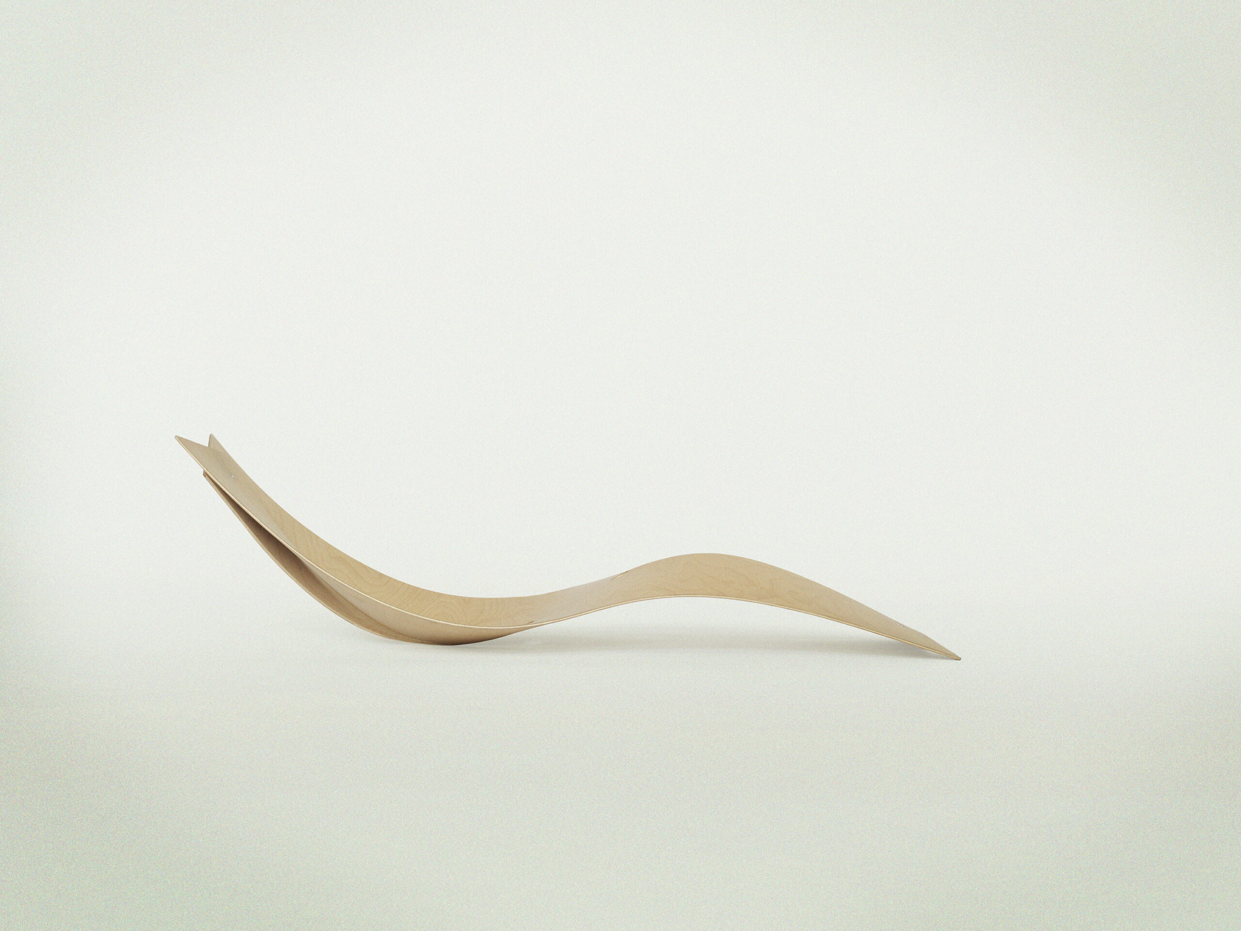
The chair is made for the exhibition ‘Værktøj 1’

We can’t afford not to care
“The Bitterness of poor quality remains, long after the sweetness of low price is forgotten” (Benjamin Franklin)
I’ve always felt slightly uncomfortable about what we do as designers. We create new products for a world that’s already full of them. Lots of material and production resources go into bringing them to market. New seasons, new trends, new objects, more consumption. We keep this wheel spinning while we, at the same time, talk about supporting the green transition. Doesn’t quite make sense.
I’m not saying we should quit doing what we do. But I am saying that we as designers and the industry we belong to, need to start thinking and working differently.
‘Less but better’ as Dieter Rams famously put it, should be our guiding principle. Producing less and making sure that what we do create is produced with care – from a design as well as a manufacturing perspective.
Like a good wine, a good product needs time to mature. The vision as well as the prototype needs to be thoroughly tested. Is this really the right solution to the problem? Is it relevant? Will it last? You won’t find the answer to these questions in a week. In my experience, it can take months, even years.
Many designers and manufacturers understand that ‘quality takes time’, But they don’t believe they can afford to spend that much time on one product.
My take would be: they – and we – can’t afford not to.
When I look back at the products I’ve created, the ones that have been most successful – for me as a designer as well as the manufacturer – are the ones we’ve invested the most time in. They’ve not only sold better over a longer period; they’ve also been recognised for pushing new boundaries – functionally and aesthetically – for what design can do.
If we look at current trends, I believe the habits of the modern consumer support the ‘less but better’ argument. The new generation of consumers are not only out to get a ‘good deal’. Or rather, they’ve become far more critical when it comes to what good looks like. Relevant products, produced with care for people and the planet, have become part of their definition and influences their decision to buy.
So for me, ‘less but better’ – investing more time in doing fewer things better – is the only sustainable way forward. For us as designers and for our industry. It would certainly make me more comfortable about the purpose of our profession.
Why chairs?
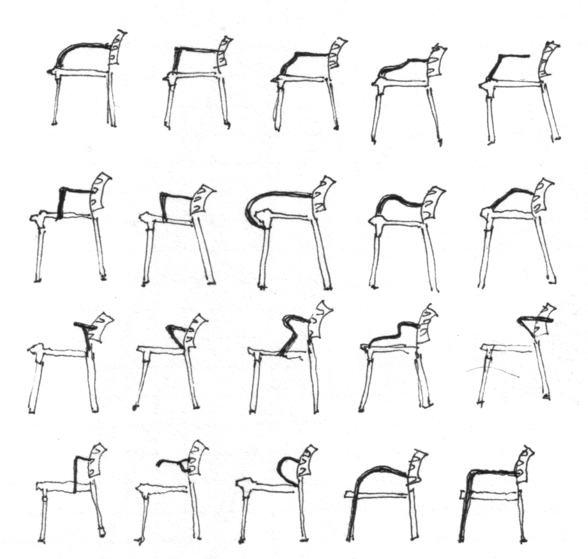
I’ve often been asked why chairs have become my medium as a designer – why I’ve designed so many chairs? The thing is, I haven’t, really. There are many designers whose production is far greater and more specialized than mine. And through the years, I have ventured into other areas too.
But it’s true that a few of my chairs, particularly the ones I’ve done for Fritz Hansen, have received a lot of attention, and the chair has certainly always fascinated me.
Essentially, it’s a very simple piece of furniture. Anyone can draw a chair in a few minutes. But to design a really good chair that’s comfortable to sit in and a pleasure to look at, is incredibly difficult. You realise that when you try. So my fascination definitely has to do with the functional and aesthetic challenges this piece of furniture presents.
Then there’s the legacy of the chair for a Danish designer. The chair represents such a prominent part of our design tradition, thanks to masters such as Wegner, Jacobsen, Juhl and Kjærholm – to name a few of the most famous. We’ve been born and raised with their masterpieces – for better or for worse, I’d say. Their work is obviously a huge inspiration. But it’s also a fairly heavy legacy to lift, or to try to reinvent, even break free from.
Finally, I think my fascination with the chair has something to do with the scale of this object.
I could never relate to designing a house, for example. The scale is simply too big, too comprehensive. In the same way, I find designing smaller things – like watches or medico equipment – difficult to deal with. You have to almost assume an ant’s perspective to get small objects right. With the chair, I find I can relate to its dimensions. But most importantly, perhaps, I can relate to its function. This is an object that has to fit the human body, like a piece of clothes. All its measures are relative to the body. For me, that connectivity between body and object makes the chair so very tangible and satisfying to work with.
The beginning holds the key
“The details are not the details. They make the design” (Charles Eames)
The key to designing a product that lasts lies in the very beginning of a project. The quality of the final product is determined by how thorough you’ve been in this initial phase; how well you’ve analysed the problem that the object is meant to solve; how far you’ve explored what the selected material allows for; how far you’ve tested whether the vision actually works in practice.
It can be compared to building a house. The foundation has to be secure and solid for the house to be safe. From an architectural perspective, the foundation also defines what’s possible in terms of the building’s final expression.
Designing furniture follows the same rule. The research phase determines all the following decisions you’re able to make in process. I often find that if the analysis has been solid enough, the product almost designs itself.
And yes, this phase takes time. And it involves a fair amount of painful ‘killing your darlings’ and frustrating fresh starts. But none of that is wasted. In fact, it’s the key to creating anything that lasts.
Great lessons come from big mistakes
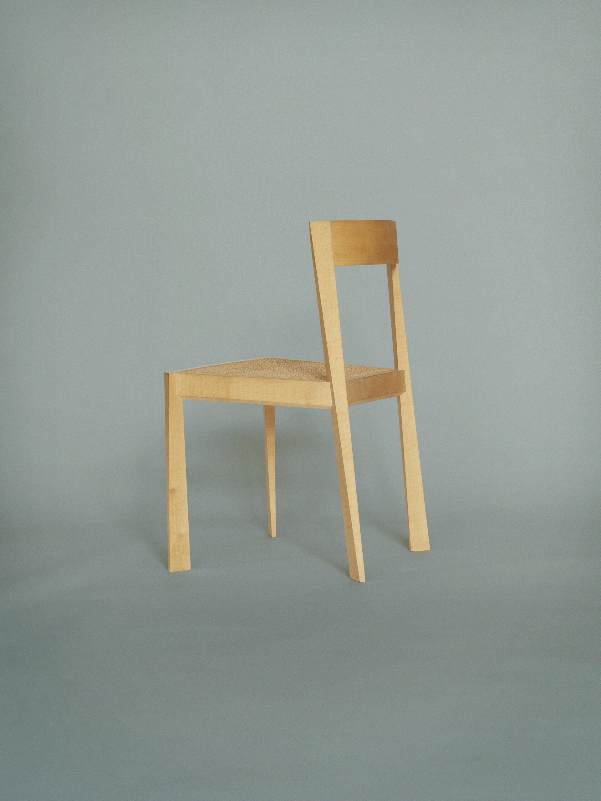
The very first chair I got in production was called ALFA. I was really happy with it – and so was Botium, the manufacturer. We thought it looked really cool. It had a strong defined frame; an elegant, geometrical expression with sharp edges; and light and shadow balanced beautifully on its seat and backrest. We really believed this would be a winner.
There were just a few, shall we say minor problems. ALFA was not very comfortable to sit on, at least not for a longer period of time. It wasn’t stackable either, so you couldn’t really store it. And because of its sharp edges, it was fairly useless in high-usage areas such as canteens or conference rooms – simply because the edges would get damaged really quickly, and make the chair look battered and worn within no time.
The combination of these facts kind of explained why ALFA didn’t sell.*
At the time, this was obviously quite a slap in the face. Or rather a wake-up call. One I was glad to get early on, because it taught me at least two really important lessons that I’ve lived by ever since.
First, that testing is everything. It’s only when the object – a chair, a table, a lamp, whatever – is put to use in its proper environment that you really know whether your vision works.
Second, aesthetics should always be second to functionality. A chair might be beautiful – which I still think ALFA is. But if it doesn’t fulfill its purpose – which in the case of a chair is to support and provide comfort for the body when seated – then what’s the point? Or rather, then it’s no longer a functional object but a decorative one.
Given the huge impact that the production objects have on our planet – not to mention the efforts involved in their decomposition – I believe we, as designers, have the responsibility to ask ourselves: Do we really need to bring more objects into the world if they are not really relevant, or don’t fulfil their purpose properly?
* The CEO of Botium, Peter Stærk loved the ALFA chair, but he also saw the humouristic side of its legacy. He used to say that he put 400 copies in production and only two where sold: one to me and one to my mum! This is not entirely true, though. The chair proved to be particularly suited for spaces such as churches and chapels. So eventually, two Danish churches and a hospital chapel bought a slightly adjusted version of ALFA, which had better seating comfort.