Kasper Salto

Selected projects across different categories

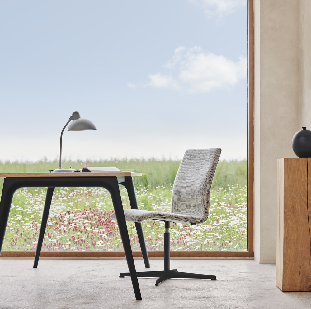
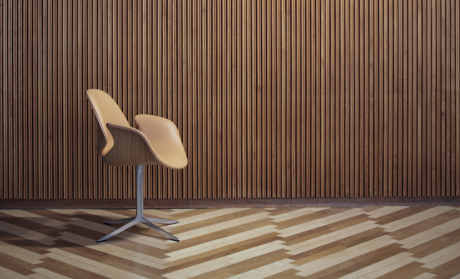
The Council family
Project:

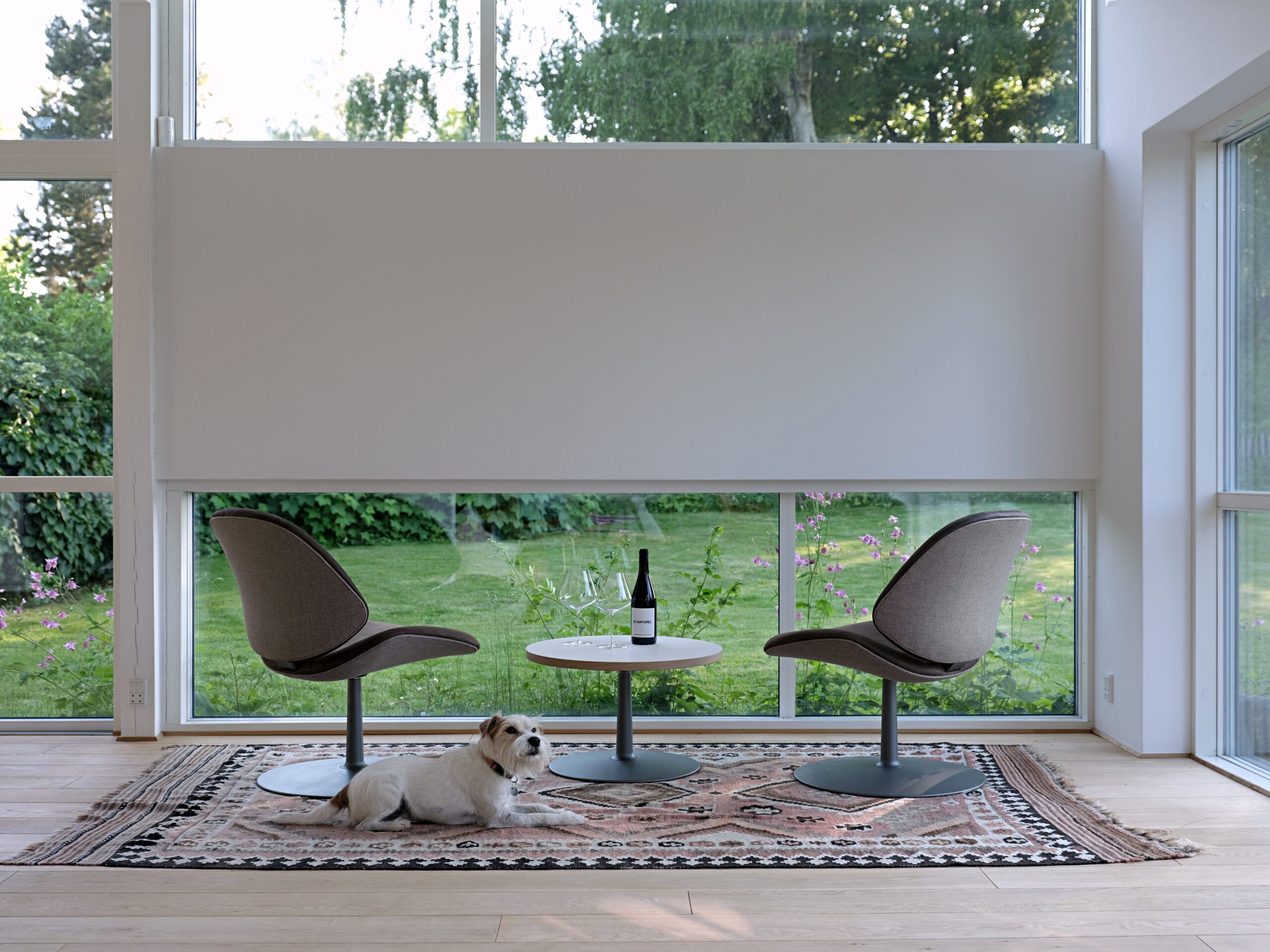
A chair, a lounge chair and a table series. Design Salto & Sigsgaard

Year:

2021

Manufacturer:

Onecollection

The brief
The Council family is the result of a design project that began more than 10 years ago. In 2011, Salto & Sigsgaard entered the design competition, issued by the Danish Arts Foundation, to create new furniture for the Trusteeship Council Chamber in the UN building, NYC. Specifically new chairs and table for the Secretariat and tables for the delegates encircling the Secretariat’s central seating area.

Our entry won – which led to a close collaboration with the manufacturer Onecollection and the idea to create a whole Council family inspired by the original version.

The concept
The DNA of the Council family is comfort. The original version of the Council chair was designed as a good desk chair that offered good seating comfort for people at work – in this case, the members of the Secretariat. These new members of the Council family should cover all other situations that also call for soft, comfortable seating – in private sitting rooms, restaurants, receptions, lobbies and other public spaces.

The solution
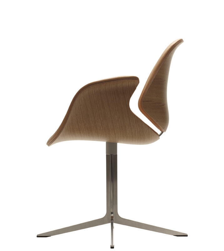
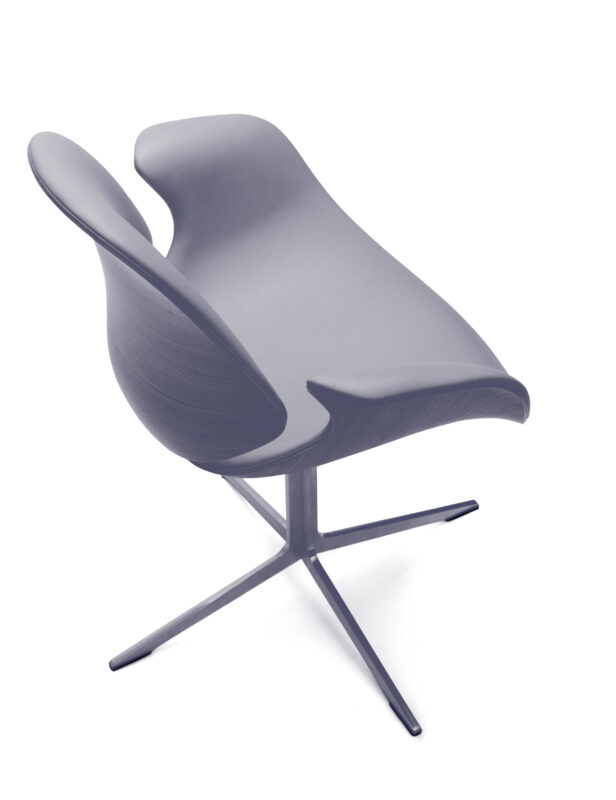
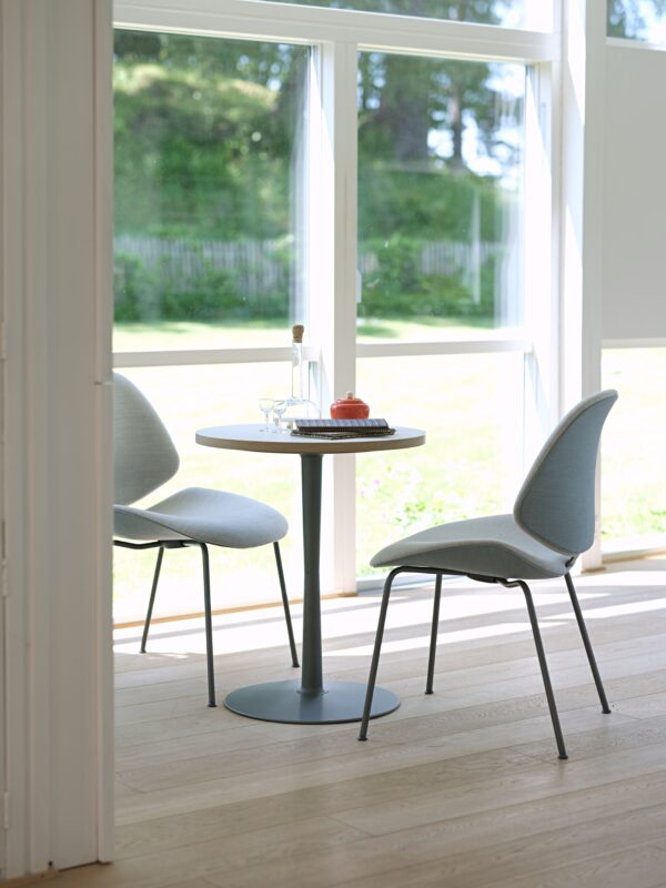
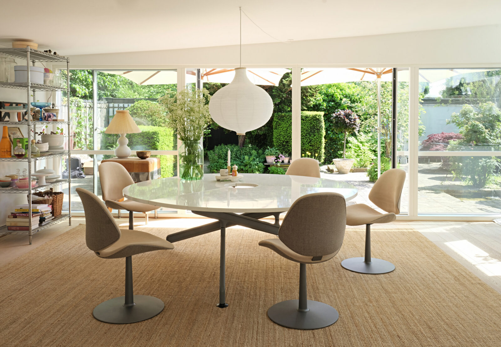
Comfort comes from the upholstered seat and back as well as the flexibility created by the gap between the seat and the back and the steel construction supporting the chair. To accommodate the needs and styles of different interior spaces, the two types of chairs come with either four legs or a single column base. Both versions are upholstered so they can easily be refitted with either textile or leather when wear and tear or the need for a new look call for it. In the first series, we have worked with a mix of different colours as well as textile and leather upholstery, to allow for contrast and make the shape and silhouette of the chairs stand out.
Pluralis
Project:

Table system and stand-alone table

Year:

2016

Manufacturer:

Fritz Hansen A/S

The brief
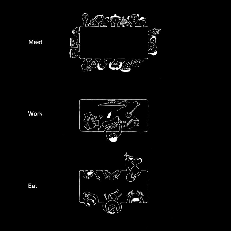
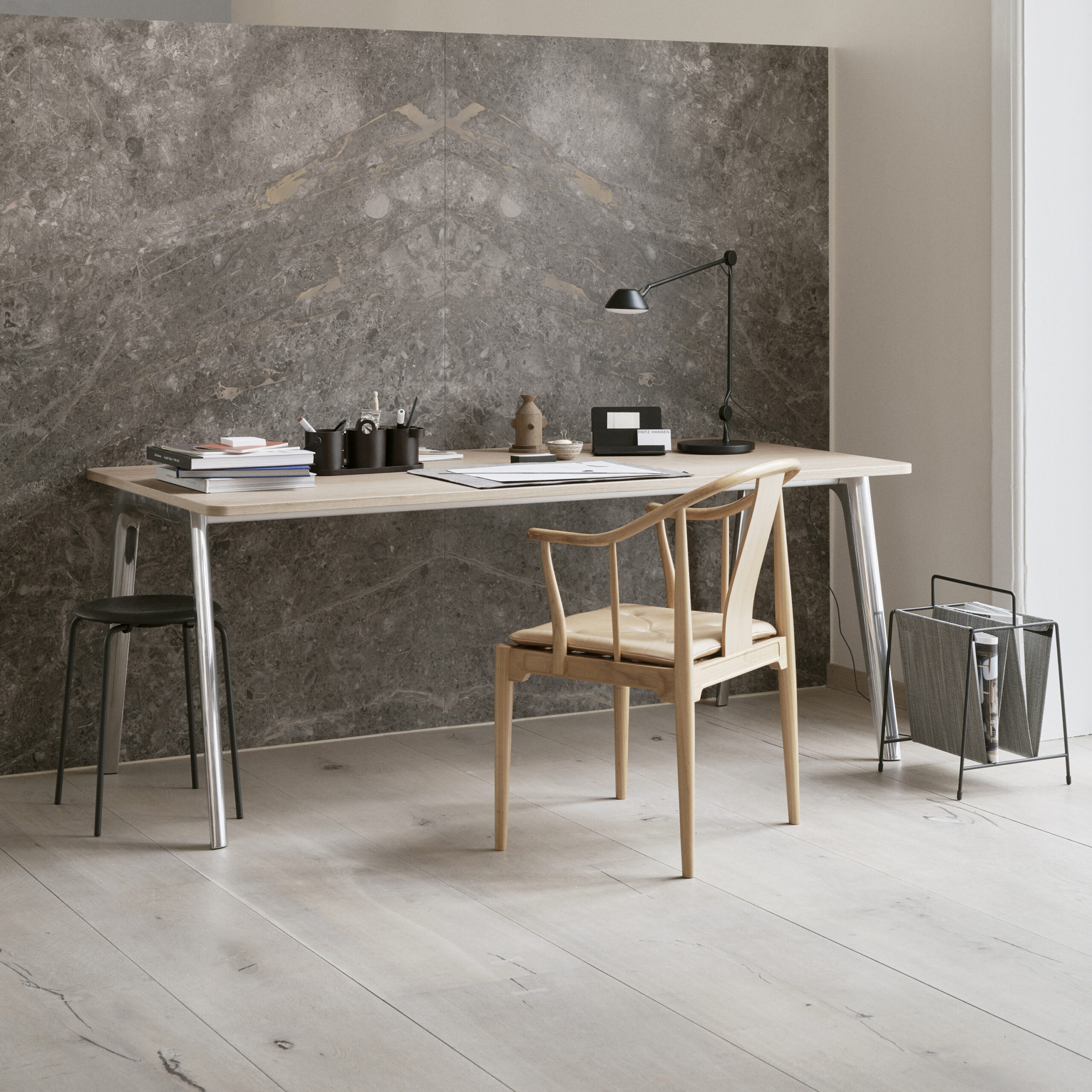
Fritz Hansen was looking for a new table concept that could be manufactured in a variety of sizes and serve several functions: as a meeting room table, a work desk or a dining table.

The concept
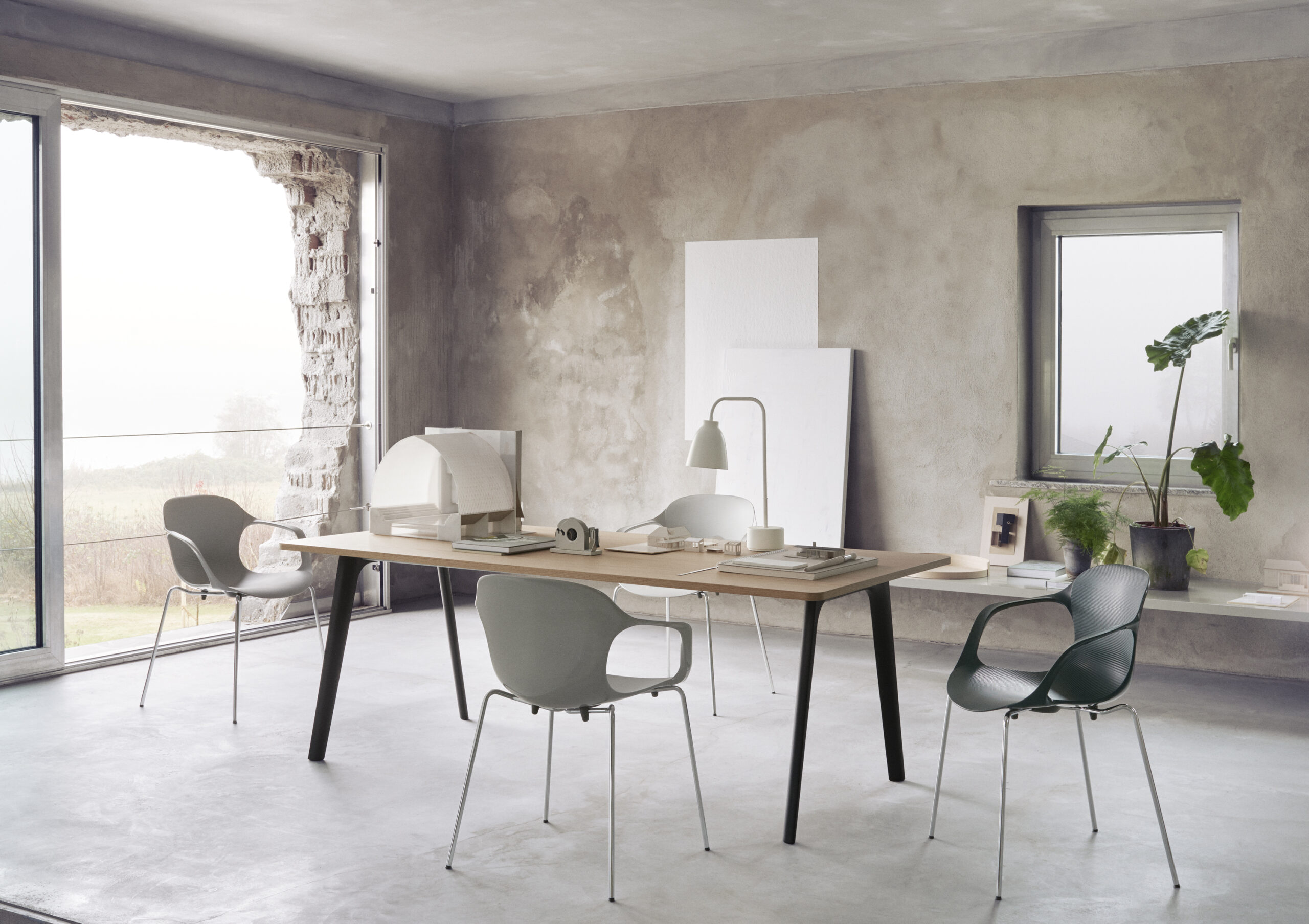
I wanted to create a simple and informal meeting table that would invite people in and establish a calm atmosphere in a room.

Craftsmen working in fields of carpentry, boat building or forestry will know the sawhorse or trestle – the construction used to hold a tabletop or another type of heavy load during the work process. That’s what inspired the construction supporting the tabletop for PLURALIS.

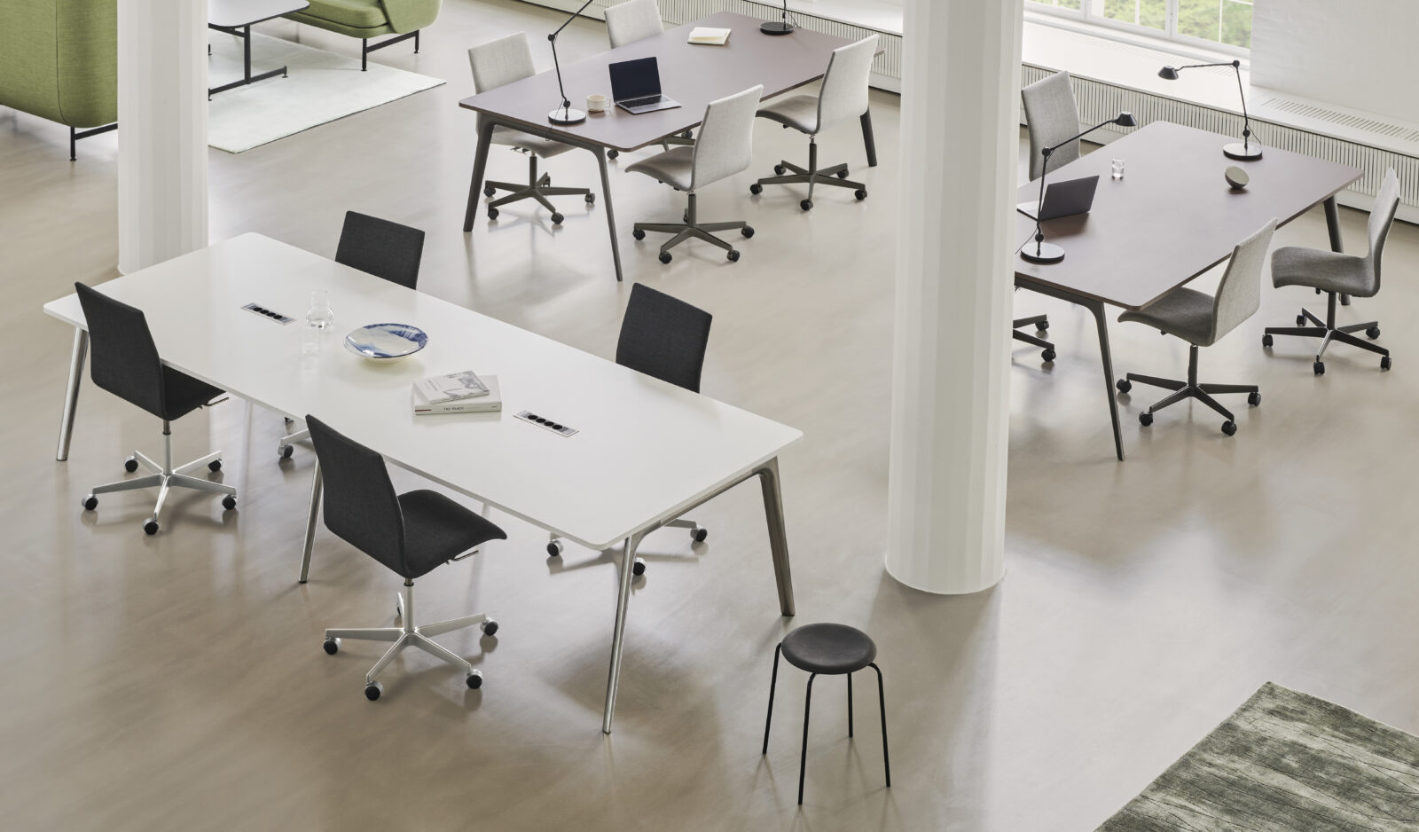
Functionally, the trestle construction makes the table very stable and gives the people sitting round the table plenty of legroom. Aesthetically, it makes the design of the table very easy to decode.
Despite its solidity, the construction actually appears light and inviting, primarily because of the soft outward curves of the legs. Also, when you walk around the table, a real-time transformation seems to take place as the profiles in the trestle structure create the illusion of dimensions changing.

Read more

The solution
I chose the name PLURALIS to bring out the versatility of this product. This table can be used as a work desk, a meeting table or a dining table. And it can work in a variety of spaces – from smaller sitting rooms at home to large meeting rooms at conference venues.

To allow for such multiple use, PLURALIS can be extended to a variety of lengths and widths. It also comes with in-built cable management system installed under the tabletop.

In 2021, the construction was updated with a hybrid leg profile, which adds extra strength to the trestle structure, allowing for extremely long and wide versions of the table, without having two legs side by side under each assembly.

Read less
NAP
Project:

Stacking chair

Year:

2011

Manufacturer:

Fritz Hansen A/S

The brief
The NAP chair was commissioned by Fritz Hansen in 2008. They were looking to produce a new, functional stacking chair with great comfort. The successor to ICE, only in a lower price range.

The concept
I read somewhere that Hans J. Wegner once said that there’s no better seating position than ‘the next one’. And he’s so right. We shift in chairs to find a new, more comfortable position or to allow for a new type of ‘activity’. These movements are critical cues when you’re designing a chair.

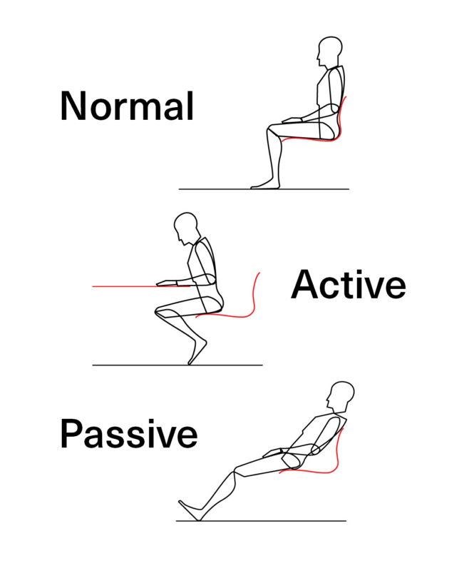
For years, I’ve been observing how people sit in chairs. I discovered that there are basically three standard positions – ‘normal’, ‘active’ and ‘passive’ – matching what we typically do when we sit in chairs: we eat or socialise; we work; or we relax.

Read more

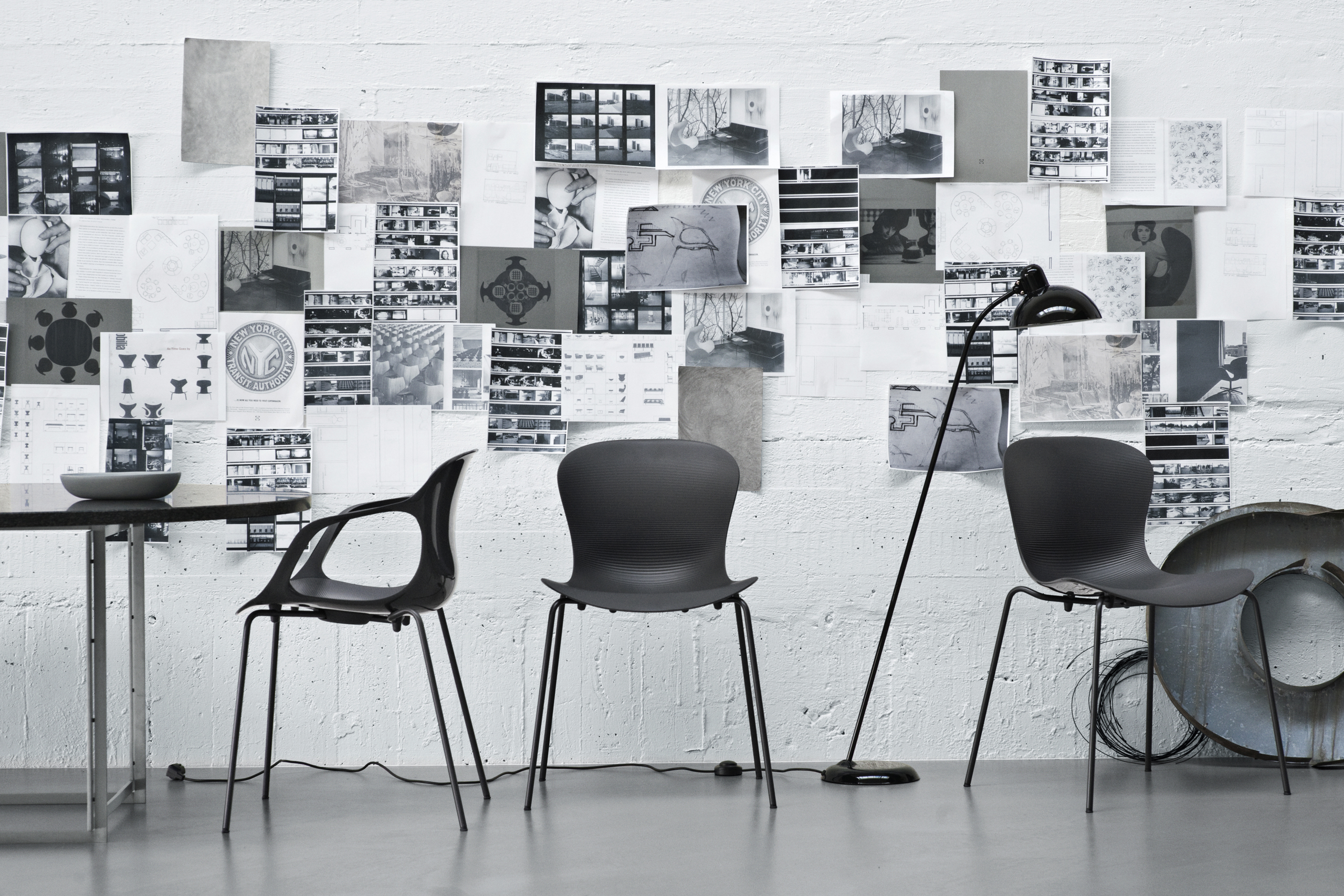
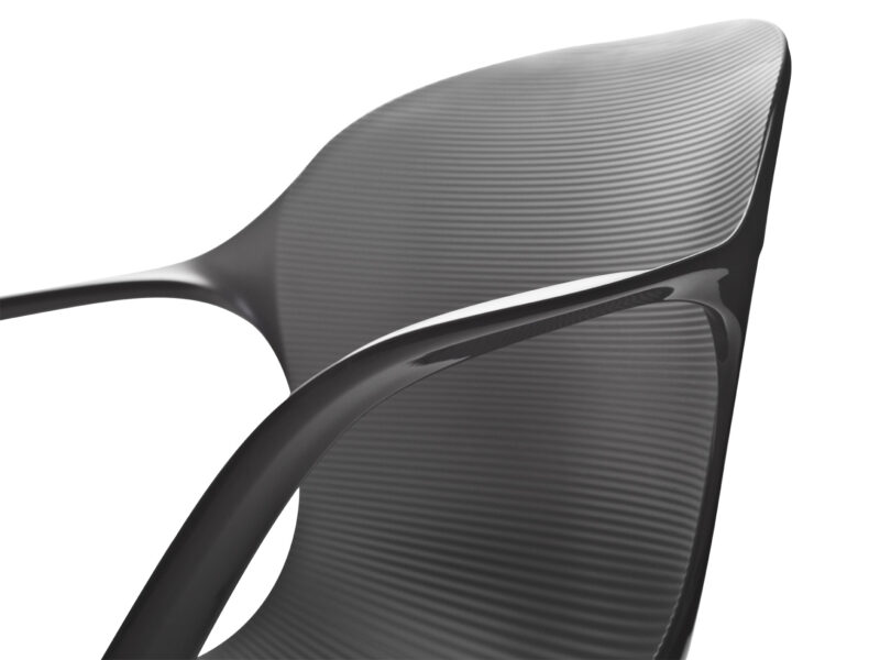
Guided by these observations, I designed a shell geometry that accommodated these three seating positions. Starting with the mirror line in the shell that controls most of the geometry of the surface, and working my way out to the edges, I ended up with a very organic shell that allows for sitting while eating, working and relaxing. The ripples in the surface of the shell prevent the person from sliding in the chair; they also double as a low-tech cooling function, letting heat slip out along the ripples.

To bring out the rationale that had inspired the design, I decided to name the chair NAP.

The solution
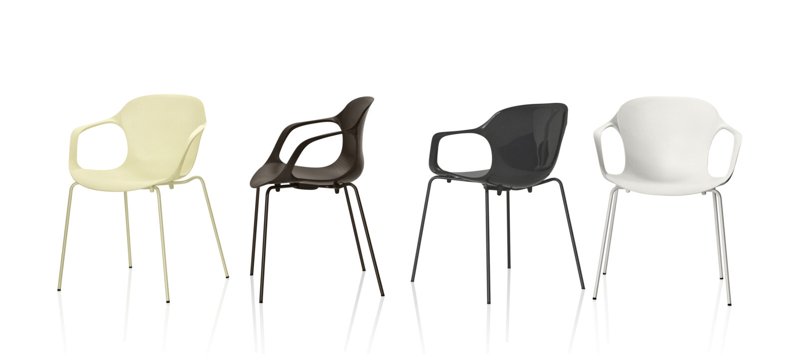
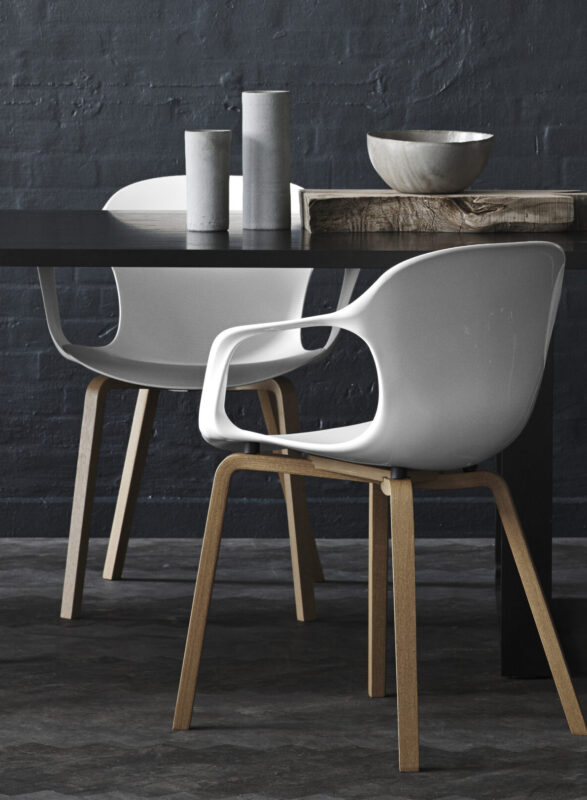
NAP comes in a variety of editions: stackable, barstool and with a wooden base and is available in four colours.

In 2011, NAP won the Danish Design Award. The jury said:

“NAP is a chair that illustrates most convincingly that it is possible to create a product with a high international level of quality that also is an unmistakable carrier of essential Nordic design characteristics: simplicity, function and attention to the details.… NAP has incredibly good and flexible seating comfort. … It is stable and robust, but as a solitary piece of furniture it has a sculptural quality that makes it a pleasure both to look at and to sit in. NAP has the potential to become a design classic!”

 Get the jury’s full evaluation [insert LINK with full jury text]

Read less
The original colours for the NAP chair
The three main positions that define the NAP shell geometry
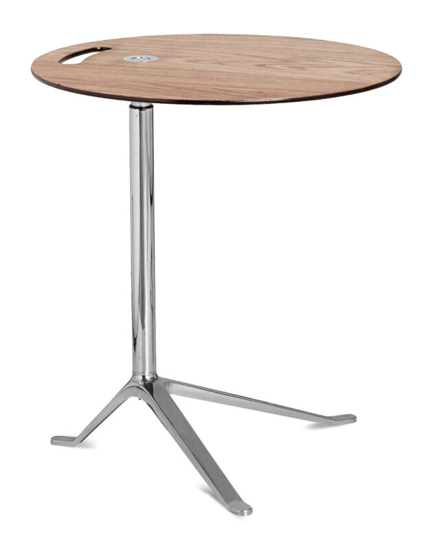
Little Friend
Project:

Sidetable with adjustable height

Year:

2005

Manufacturer:

Fritz Hansen A/S

The brief
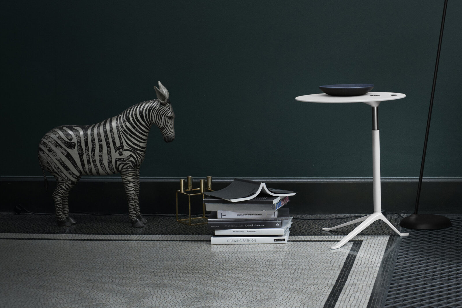
Initially, LITTLE FRIEND was part of a larger brief for a series of smaller products, including coat hangers, waste paper bins and magazine stands. As part of this collection, Fritz Hansen also wanted a small side table to go with Arne Jacobsen’s ‘Egg’ and ‘Swan’ series.

Of all these products, LITTLE FRIEND was the only product that actually went into production. It still serves as a side table to Arne Jacobsen’s classics. But as the concept developed, it proved to meet other needs as well.

The concept
Flexibility has become a key part of modern working life. We not only work from different locations; we’re also expected to make the most of our time when we’re on the go, which means working in airports, hotel rooms or lounges, reception areas – and of course in more private spaces such as our own sitting room.

Apart from creating a worthy ‘friend’ to Jacobsen’s classics, I wanted to design a table that lent itself to ‘the flexibility of work’. I was keen to find a solution to those awkward positions we all find ourselves in, hunched over our laptop, balancing it awkwardly on our knees.

Read more

So I set about creating a lightweight table that you could easily move around, adjust to any seat height, and with a tabletop large enough to carry your laptop. The floating tray or extra hand you need when you sit down to work, anywhere.

The name, LITTLE FRIEND is inspired partly by the table’s function and partly by The Helper from the Donald Duck cartoons, an inventive little robot with a lightbulb as its head.

The solution
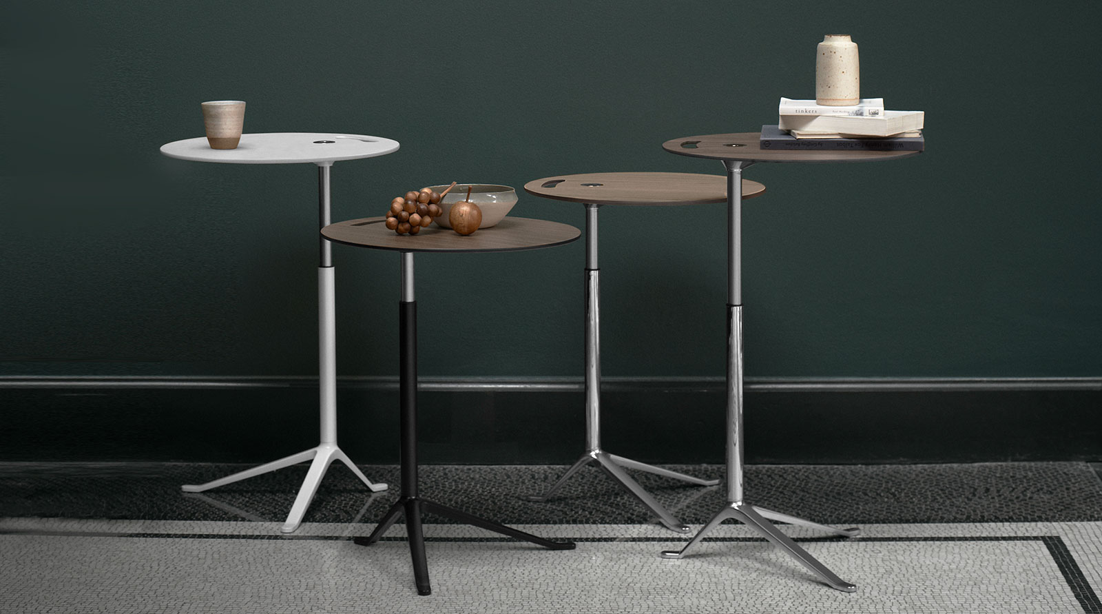
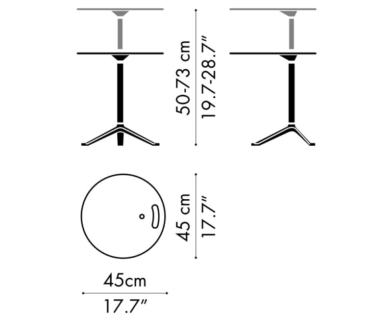
Flexibility is a key part of the design of LITTLE FRIEND. The axis of the table is off center, so when you sit on a sofa or lounge chair you can draw the table close to your body. An air-gas mechanism allows you to adjust the height from 20 to 28 inches, which is normal table height, simply by pressing a button. Finally, the mobility of this lightweight table is indicated by the handle in the tabletop – a visual cue that almost speaks to you and says: ‘I’m your friend, take me with you’.

LITTLE FRIEND is available in three colours and in a wooden tabletop version.

Read less
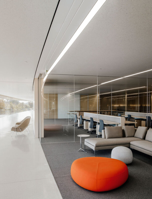
500 LITTLE FRIENDS live at Apple’s headquarters in Cuppertino, US.
The UN Council chair
Project:

Council chair and table, designed for the Trusteeship Council Chamber in the United Nations Building, NYC. Design Salto & Sigsgaard

Year:

2010/2011

Manufacturer:

Onecollection

The brief
In connection with the extensive five-year renovation of the United Nation HQ building in NY (2008 to 2013), the Danish Arts Foundation issued a competition to refurbish the Trusteeship Council Chamber, originally designed by one of the great Danish modernists, Finn Juhl in the early 1950s. Specifically new furniture for the central seating area – that is, the Secretariat’s table and chairs – as well as the delegates’ tables that encircle it.

The project was administered by the Danish Ministry of Culture in close collaboration with the Danish Ministry of Foreign Affairs – and the Danish Arts Foundation was responsible for the competition itself. Thomas Sigsgaard and I was invited to participate in this competition.

The concept
Given that the chair was designed for the Secretariat’s table in the Trusteeship Council Chamber – where the secretaries would be seated sometimes for long hours – the essential premise for the Secretariat chair was obviously to ensure great seating comfort.

Inspired by Finn Juhl’s designs – particularly his deliberate exposure of construction parts and the contact zone between the furniture shell and the human body – we wanted to produce a very simple chair that consisted of only two main parts: a shell and a base part.

Read more

To do that, we had to use a material that was extremely flexible and able to adapt to the human body. We chose 3D veneer by REHOLZ, which can bend into almost any double-curved shape.

Our initial idea was to create the seat shell in one piece. But even in 3D veneer, this proved too ambitious. REHOLZ knew from experience that the veneer would crack in the extreme curve between the seat and the back of the chair. Turning a challenge into an opportunity, we decided to admit the feature of the ‘crack’ to our design, making the connecting parts flexible.

Our proposal for the delegates’ tables followed the same approach as the Secretariat chair: simple, elegant and deliberately unobtrusive in relation to the existing interior. The tables are designed as one profile, curved to fit the Chamber’s semi-circled rows of seating.

The solution
In their adjudication, the jury said:

With their exquisite, inviting appearance, these designs are very much in keeping with the original style and mood of the chamber. Kasper Salto and Thomas Sigsgaard’s designs are qualified, modern and forward-thinking in style, with an international touch. Their proposal is …works well in conjunction with the room while at the same time creating a contrast to it, thus emphasizing how the space and the spirit of the room are preserved. This project will bring to the Chamber new qualities, which … underpin Finn Juhl’s original concept and, at the same time, meet the functional requirements laid down by the UN.”

We won the competition in 2011. The renovation of the entire chamber was completed in 2013 and inaugurated at a ceremony in April that year, with the attendance of Crown Princess Mary of Denmark, then Secretary-General Ban Ki-moon and then Danish Minister for Development Cooperation, Christian Friis Bach.

What is now known as the Council chair is produced by ONECOLLECTION – the Danish furniture responsible for manufacturing all design classics under the brand House of Finn Juhl.

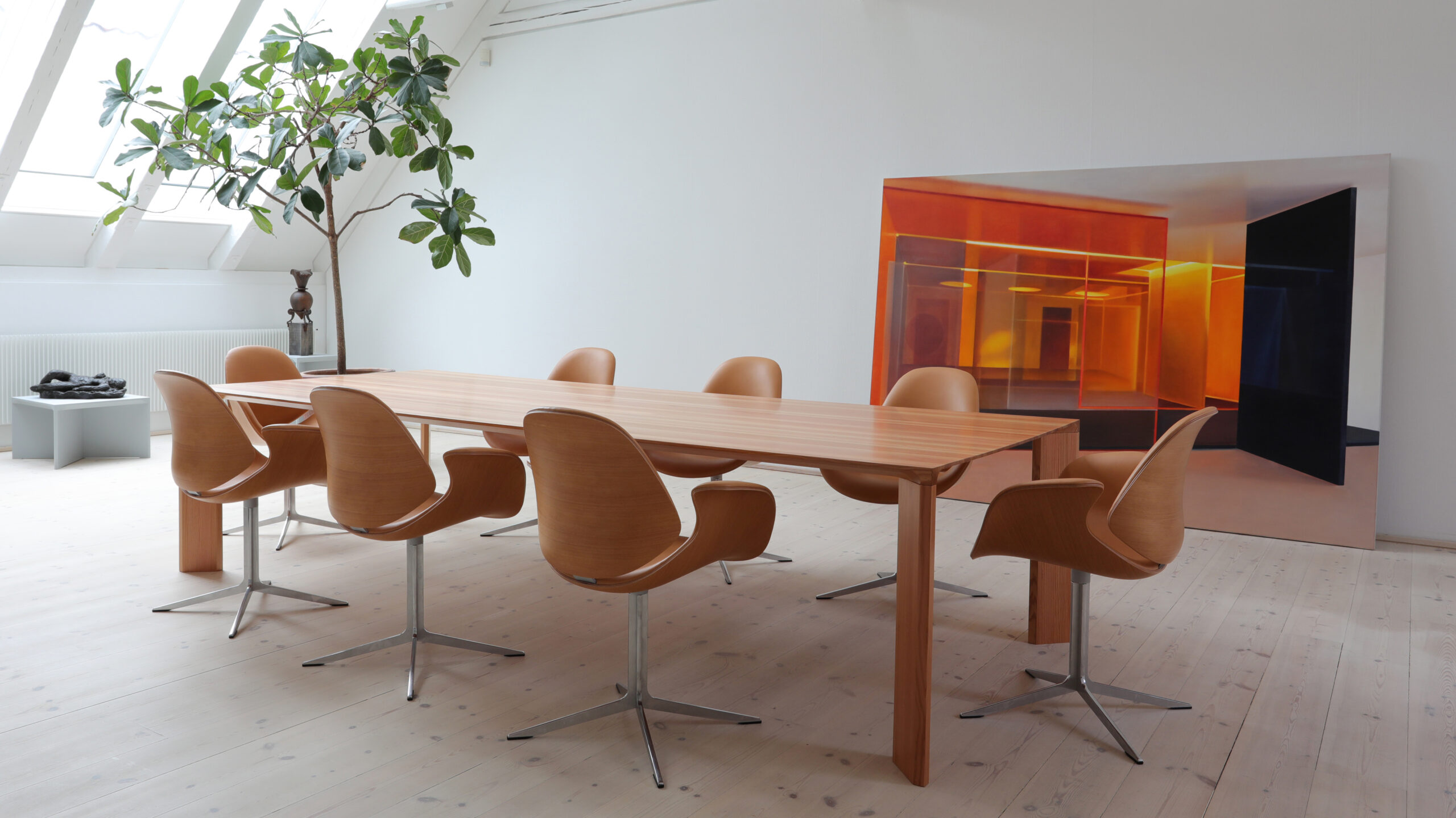
In 2021, Onecollection launched our new additions to the Council chair family [insert link to this entry under ‘WORK], which now includes the original Council chair, one without armrests and a lounge version which is lower and a slightly reclined version of the original. The family also includes a series of tables to match each type of chair.

Read less
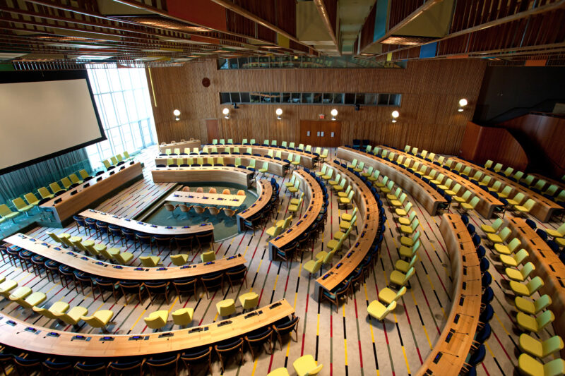
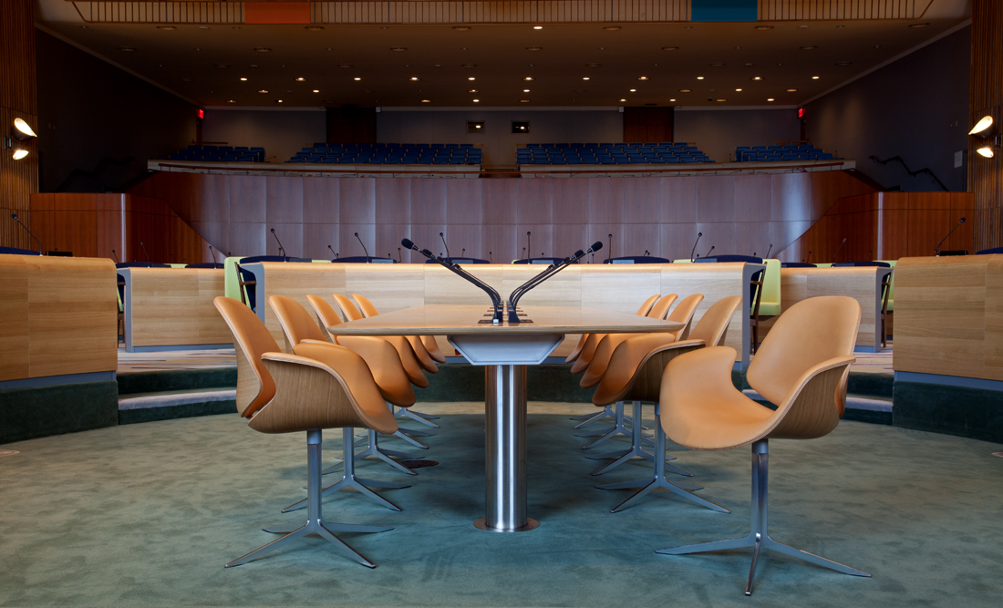
The renovated and refurbished Trusteeship Council Chamber, with the new Council chairs and table at the centre of the room and the delegates’ tables encircling them in semi-circle rows.
The Secretariat’s table and chairs in the Trusteeship Council Chamber, UN building, NYC.
ICE
Project:

Stacking chair for indoor and outdoor use

Year:

2002

Manufacturer:

Fritz Hansen A/S

The brief
Bjørn Stegger, former Head of Design at Fritz Hansen, had seen RUNNER at the Danish Cabinetmakers Exhibition in May 1997. He invited me to join the competition to design a new stackable chair for indoor and outdoor use. The brief was ambitious. The company was looking for no less than ‘the chair for the future’ from Fritz Hansen.

In 1999 – after two long years of sketching, testing and conceptual adjustments – I entered by my bid. Fortunately, it matched what Fritz Hansen was looking for. Three years’ worth of further discussions, adjustments and testing followed. And finally, in 2002, ICE was launched at the Orgatech exhibition in Cologne.

The concept
The concept for ICE had to tick several boxes – which kind of explains why it took so long to develop.

Apart from providing optimal seating comfort for the body, this chair should be easy to stack, and, as a first in the Fritz Hansen collection, allow for indoor as well as outdoor use. Basically, this double function meant balancing ‘light enough’ and ‘strong enough’. Indoors, you want a chair that looks refined and elegant. Outdoors, you want it to be robust and able to withstand any kind of weather.

Read more

Creating a chair for the future obviously meant making the most of the opportunities that modern materials and production methods bring. At the same time, we wanted this chair to acknowledge its heritage – the tradition of craftsmanship and visual elegance that Danish furniture design is known for.

Conceptually, ICE bears some resemblance to RUNNER in its reflection of the human spine and ribcage. But with this chair, I wanted to push the boundaries of this concept even further. The chair’s bone-like ribs held together by a soft spine preserves the human, organic expression but reduces it to its simplest form.

The solution
ICE can be described as a classic chair but produced in new, high-tech materials – which neither I nor the design and product development team at Fritz Hansen had ever worked in before.

Following countless tests and prototypes, we solved challenge of ‘light enough’ and ‘strong enough’ by combining anodized aluminium for the frame and ASA-plastic for the seat and back of the chair. While super robust, plastic still has a softness to it, adding seating comfort and insulating against the cold when used outdoors. And by creating the frame in aluminium, we got the light weight, strong structure we were looking for.

Following its launch, ICE was created in different editions – regular and barstool, with and without arm rests, plastic and upholstered. A new textile, ‘Blitz’ from Kvardrat, was created for the upholstered version, designed by my wife, textile designer Rikke Salto – who also defined the colour palette for the plastic versions of ICE.

Read less
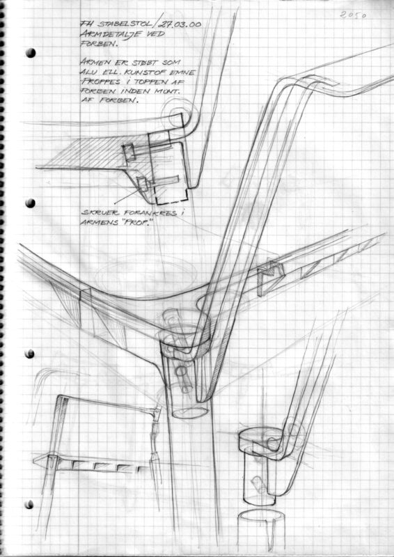
One of many construction sketches – here, an early idea for the armrest.
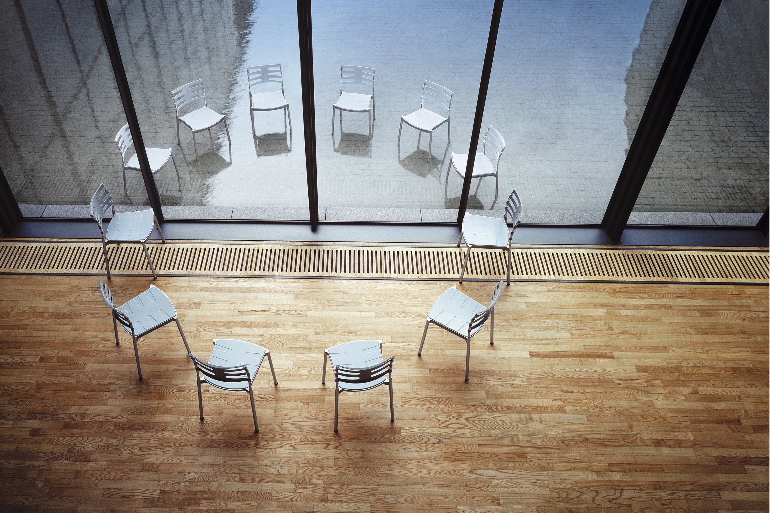
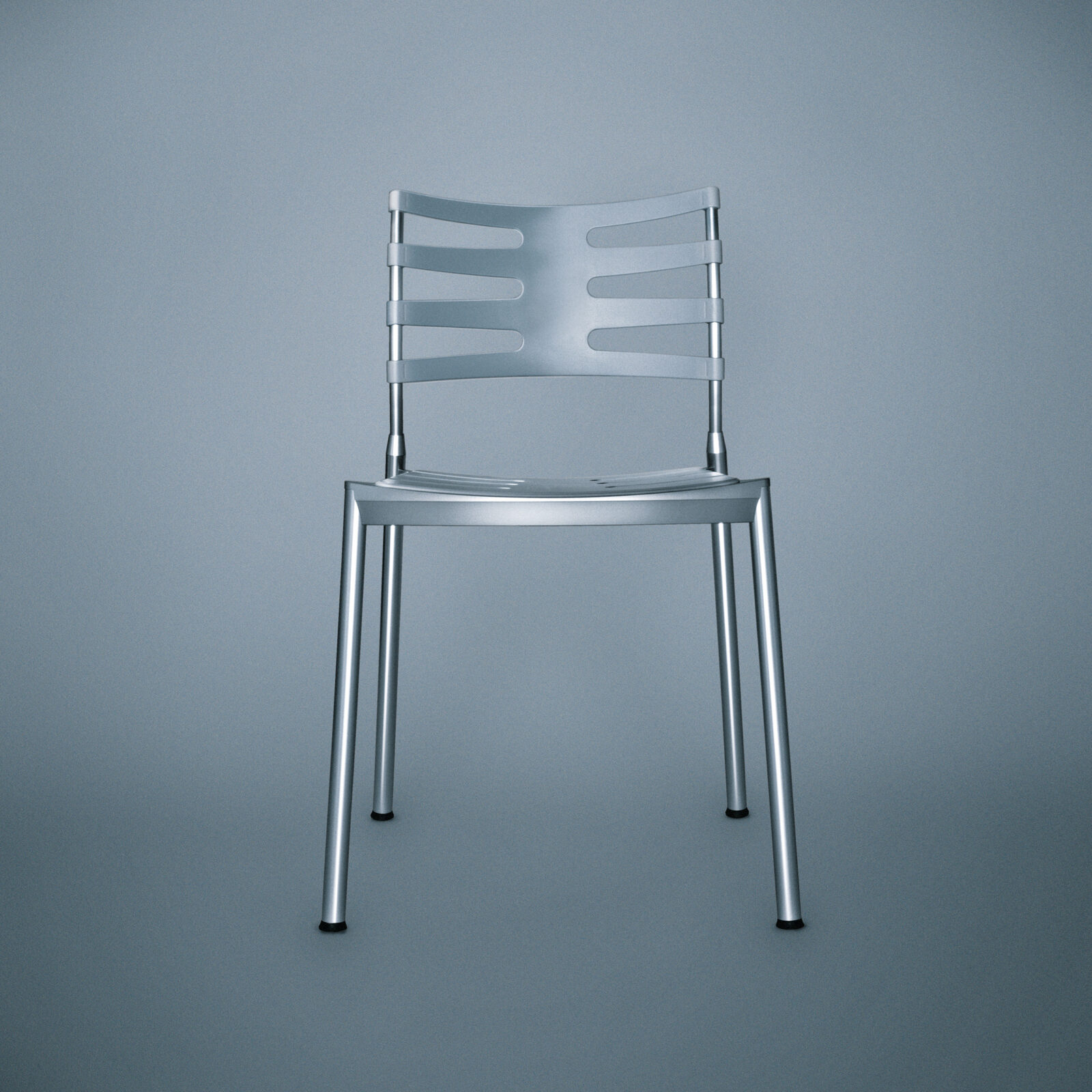
ICE in its standard version: aluminum frame and ASA-plastic seat and back.
RUNNER
Project:

Stacking chair

Year:

1998

Manufacturer:

Midform A/S

The brief
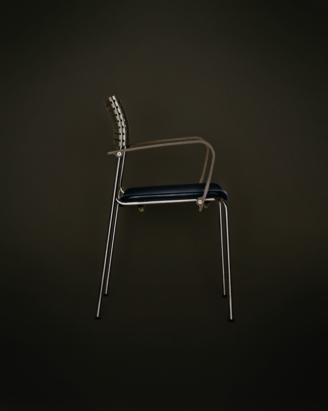
RUNNER was my second chair project. As it hadn’t been commissioned by anyone, there was no real brief. Only my own ambition to create a multifunctional chair with really good seating comfort. I wanted it to offer relevant functional features such easy stacking and coupling in rows, for example for conference use.

Since my first chair project was called BLADE, it made sense to call this second one RUNNER. Obviously, a tribute to Ridley Scott’s cinematic masterpiece, Bladerunner, which is one of my favourite films. But it also, quite appropriately, became a tribute to the Danish middle distance runner, Wilson Kiepketer who held the 800m world record during 1990s – and who kindly agreed to feature in the marketing campaign promoting the chair.

The concept
In the 1990s, formalism seemed to define the agenda for chair design. With RUNNER, I wanted to move away from this rigid, form-driven paradigm and get back to the real and more human-centred purpose: to provide comfortable support for the body. The concept of the double curved back is inspired by the spine of the human body and really the feature that makes the chair so comfortable.

Read more

To make it a light-weight chair, RUNNER is designed with as little material possible. This makes each chair very easy to move around and a stack of 10 chairs less heavy to handle. Less material also made sense from a sustainability perspective. No need to cut down an entire forest to produce a collection of chairs.

What really challenged the craftsman in me was how to get the wooden parts to join the steel construction. I not only wanted the joints to be smooth and strong; each part also had to be able to be replaced, if necessary.

The solution
I consider RUNNER my first real chair. It’s definitely the one that kick-started my career as a designer. It was the first to be manufactured – and the first to get some attention in the industry, particularly after winning the Danish ‘ID Award’ in 1999. But most importantly, it paved the way for my collaboration with Fritz Hansen.

After more than two decades, the chair is still in production and selling well, which I’m really proud to see.

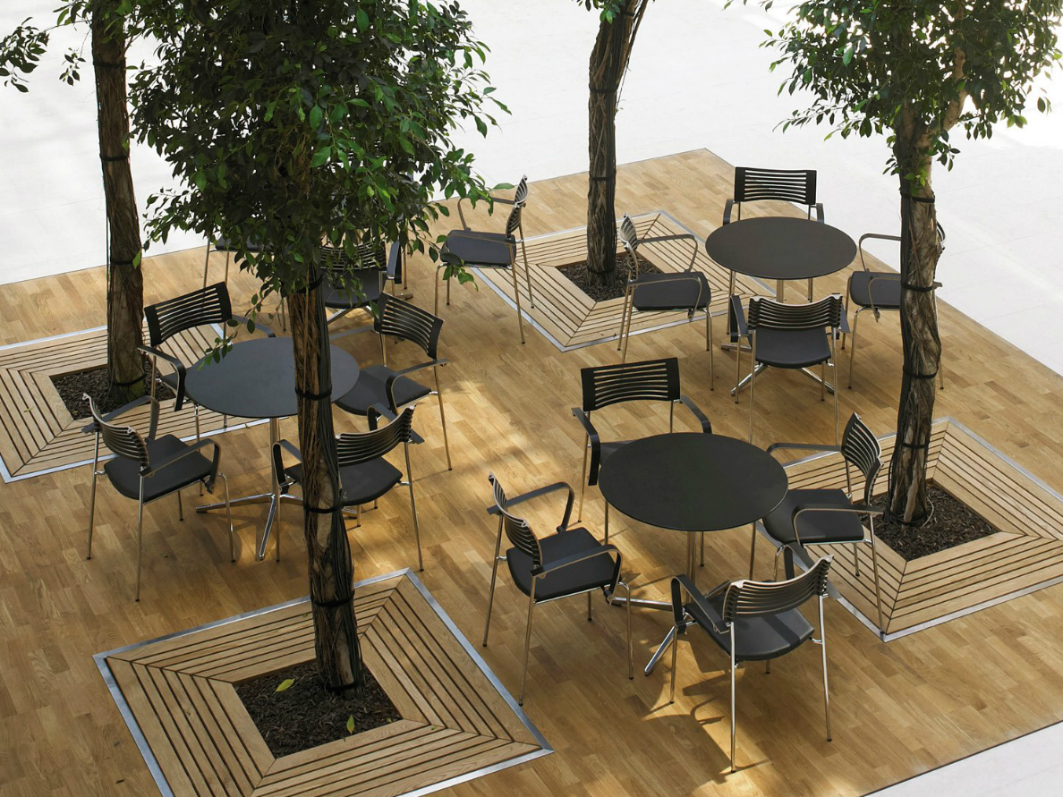
Since its launch in 1997, RUNNER has received five design prizes:

  • The ‘Bo Bedre Prisen’ (Denmark 1997)
  • the G-prize/Good Design Award (Japan 1998)
  • Moderni byt/(Czechoslovakia 1998)
  • Spectrum Award for Product Excellence (UK 1998)
  • ‘ID Prisen’/Danish Design Award (Denmark 1999)

Read less
New Carlsberg
Project:

New Carlsberg Foundation, restoration project. Design Salto & Sigsgaard

Year:

2015-2018

Manufacturer:

Onecollection


The brief
The New Carlsberg Foundation (NCF) is a private foundation, established more than a century ago by the famous Danish brewer, Carl Jacobsen and his wife. Funded mainly by dividends from shares in the Carlsberg brewery, the NCF’s purpose is to support and promote art in Danish society, making it available to the widest possible audience.

As part of a restoration project, Salto & Sigsgaard was invited to come up adjustments to Wilhelm Wohlert existing interior from the 1970s and develop a series of new furniture systems for NCF’s storage of art.

The solution
Our adjustments to the interior of the NCF was based on the idea of creating a cohesive feel through the building, establishing a clear connection between its five floors and making the building itself more of a ‘transit’ for art rather than a museum.

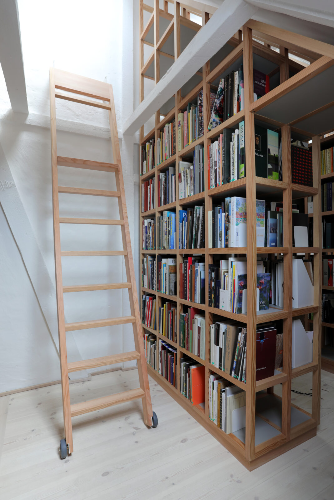
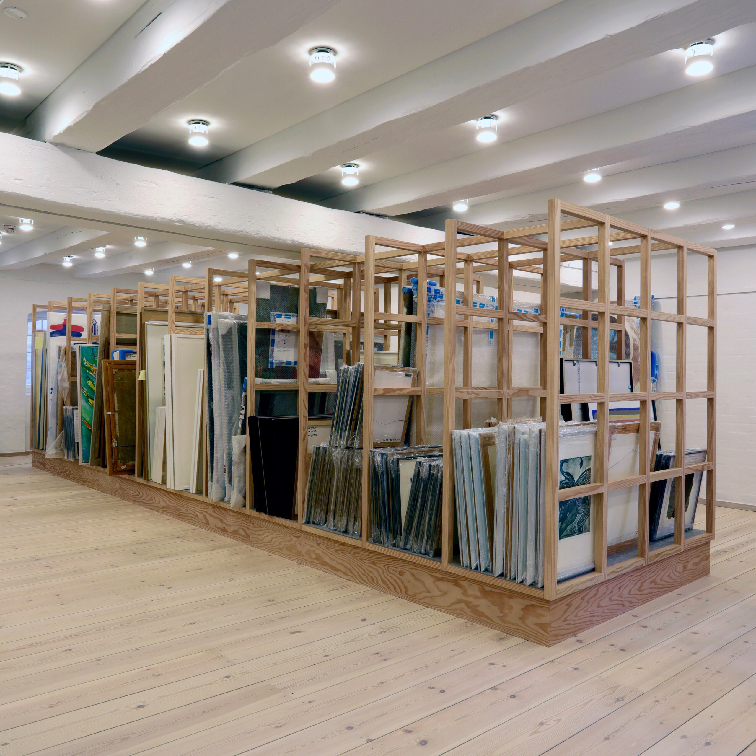
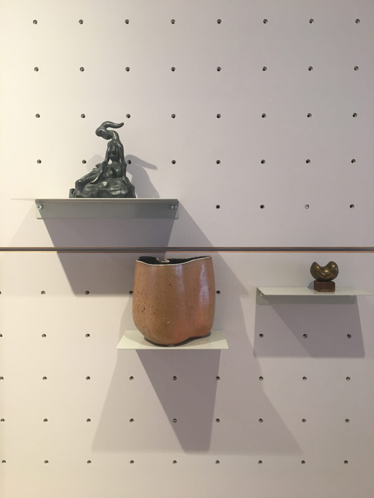
We produced six general furniture systems whose primary function was to handle the various types of art that the NCF houses:

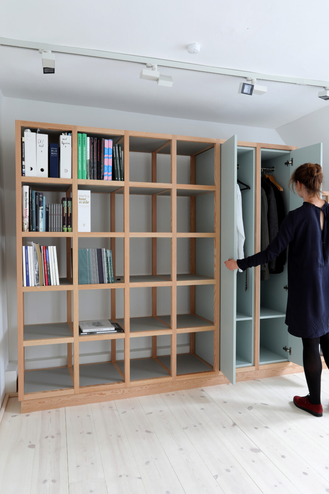
  • Libraries: A grid system of massive Oregon pine wood
  • 3D boards: Linoleum boards with Oregon pine edges and customised holes to hang the art pieces
  • Painting storage: Same grid system as used for the libraries
  • Meeting table: A massive Oregon pine wood table designed for the meeting room
  • Podiums: Sheets of lacquered MDF with a linoleum surface
  • Gallery lists: Massive Oregon pine rails to hold the paintings

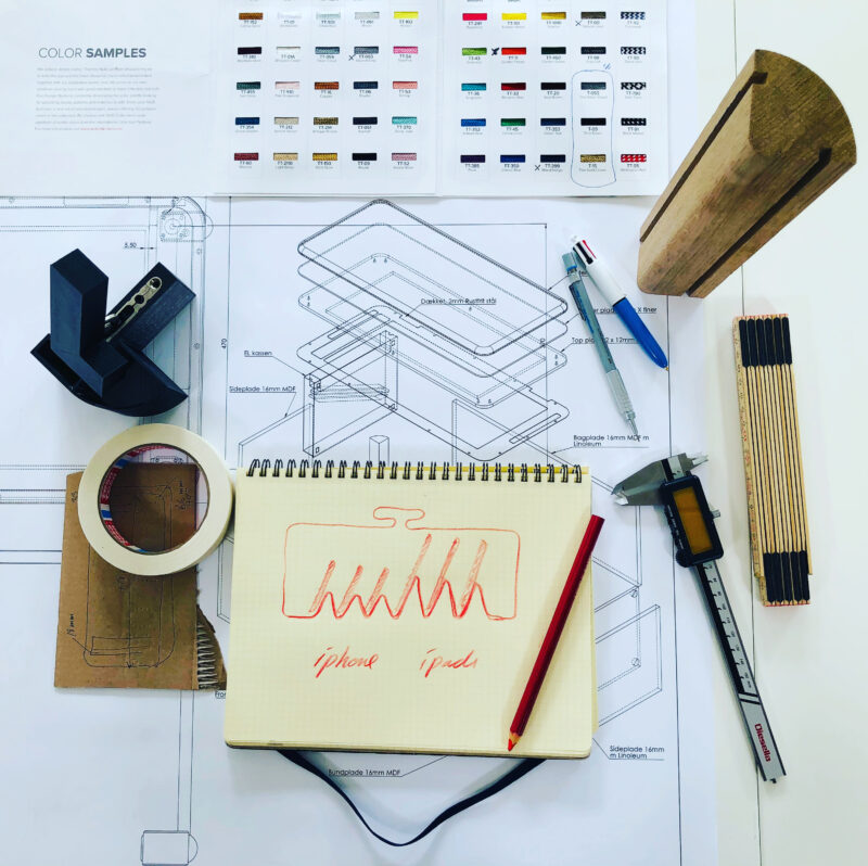
Read more

This project was done in collaboration with Elgaard Architecture and Onecollection.

Read less
UV BENCH
Project:

UV furniture

Year:

2020

Manufacturer:

Efsen UV & eB Technology

The brief
UV technology is known for its disinfectant properties – a fast, effective and chemical-free way of killing viruses and bacteria. It has been used in the healthcare sector for years to disinfect rooms, surfaces, materials and air. And its effect has been documented: a 10- second exposure to UV rays is enough to kill 99% of certain bacteria and virus types.

Including the Covid-19 virus.

As the global pandemic escalated, Thomas Efsen, second-generation owner of EFSEN UV & EB TECHNOLOGY, and his team started to explore how the benefits of UV technology might be used more broadly by other sectors in society to ensure clean and safe environments.

They got in touch because they were keen to develop a solution that was functional in terms of ensuring effective disinfection of objects and, at the same time, worked as a piece of furniture that would blend in nicely in any setting. An approach the company has termed ‘designology’.

Read more

The concept
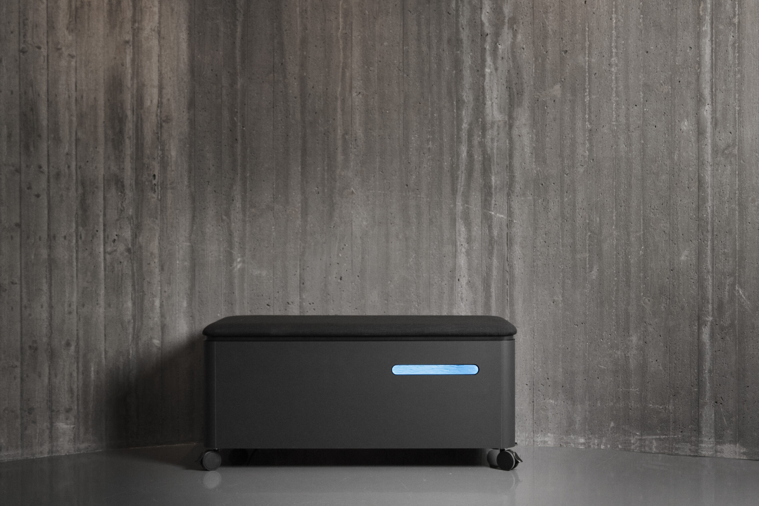
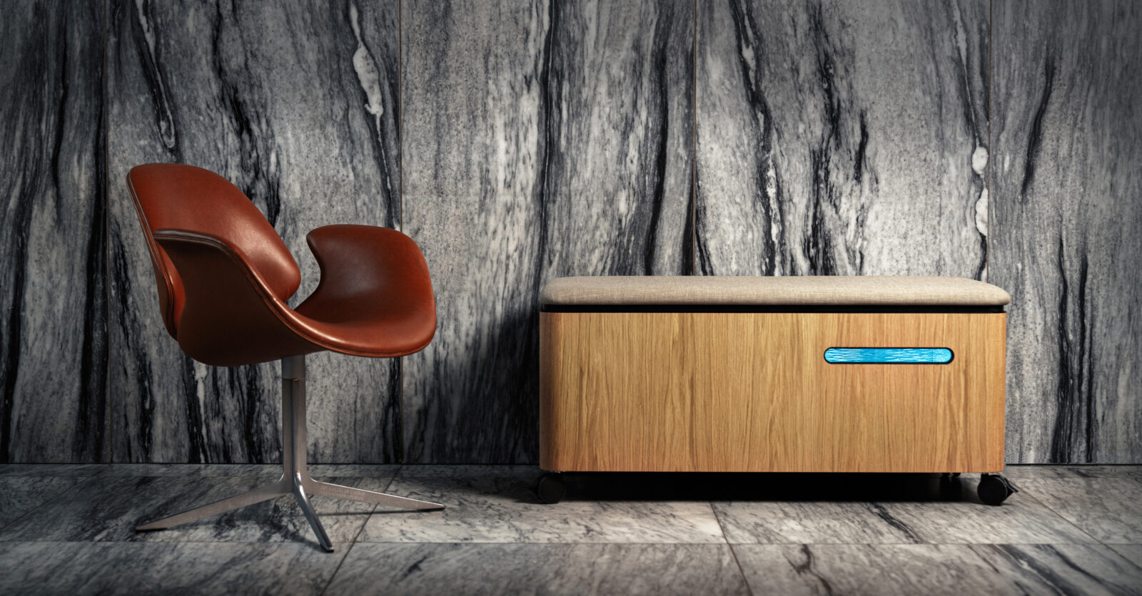
With ‘designology’ in mind, we developed the SALTO EFSEN UV BENCH – a simple solution that served several purposes.

It cleans the items you put inside it for viruses and bacteria within seconds. And when not used for disinfection, it serves as a storage box or an extra soft seat in the room.

The solution
The SALTO EFSEN UV BENCH is an excellent example of how design can be used to solve an urgent need. During the pandemic, it not only helped to improve hygiene and safety in high-usage public places. It also saved a lot of people a lot of time, disinfecting in seconds what it would take a person several minutes to clean by hand.

The SALTO EFSEN UV BENCH has been sold to kindergardens, museums and offices for disinfection of items such as toys, headsets, smartphones and laptops.

Efsen’s UV furniture series also includes a cabinet and more products are currently being developed.

During the Three Days of Design 2021 event, The SALTO EFSEN UV BENCH won the Design of the Year and the Readers’ Prize, issued by the Danish magazines, Bo Bedre, Boligmagasinet, Costume and Scandinavian Living. It was also shortlisted for the Danish Design Awards 2021.

Read less